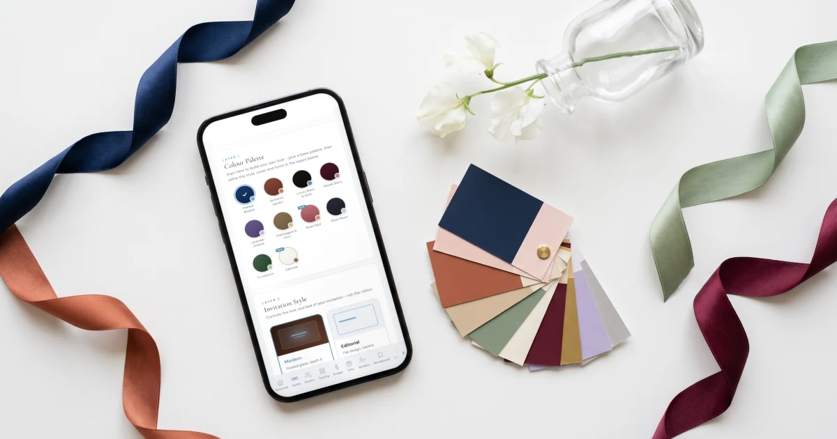
The best wedding color palettes for 2026 use four colors in a 60/30/10 split: a warm base neutral (ivory, cream or sand), a lead color (sage, dusty blue, terracotta or burgundy), a deeper tone for depth and one small accent. Fifteen proven combinations follow with hex codes, from sage and warm ivory (#8A9A7B, #EDE7DB) to a pastel theme of lavender, blush and butter (#C8B6E2, #F2C9CF, #F6E3A1). The Private Wedding App, a full wedding planner, carries your palette from the invitation theme to a dress code card with your color swatches on the guest Info page, for $19.99/month or $189 once. 3-day free trial.
A wedding color palette is the cheapest design decision you will make and the one that shows in every photograph. Get it right and the invitation, the flowers, the bridesmaids and the table look like one wedding. Get it wrong and the day looks like five good ideas that never met. This guide gives you fifteen palettes that hold up, each with four hex codes you can hand to a florist or a stationer, the season and venue each one suits, and the simple rules that stop a palette from going busy. Ten of them are sampled from the artwork of real invitation themes, so you can see them working before you commit.
How to build a wedding color palette
Four colors is the practical maximum. One base neutral that covers most surfaces, one lead color that people will remember, one deeper tone for depth, evening and type, and one accent used sparingly. Five or six colors used equally always look busier than four used in proportion.
Use them roughly 60/30/10: sixty percent base (paper, linen, candles), thirty percent lead (bridesmaids, ribbon, flowers), ten percent accent (a menu border, a wax seal, a single flower). The deeper tone carries the text and the foliage.
Then check three things before you commit. The season, because light changes color: pastels glow in spring daylight and go grey under winter candlelight. The venue, because a stone courtyard, a dark ballroom and a beach each pull colors in a different direction. And the white: warm ivory flatters almost every palette, while bright optical white makes muted colors look tired.
All 15 palettes at a glance
Every palette below has four hex codes. Tap any swatch in the sections that follow to copy its code.
1. Sage and warm ivory
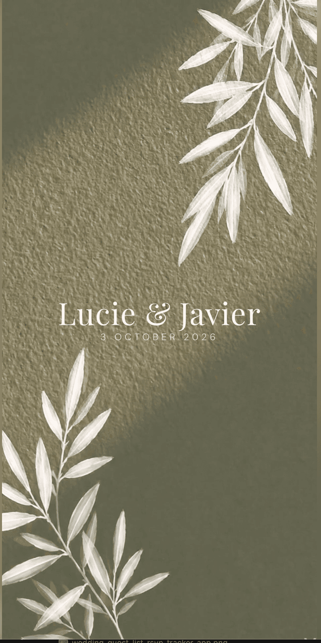
The most requested wedding color of the last few years, and still the safest. Sage is a neutral pretending to be a color: it sits beside almost anything and reads expensive in daylight. Pair it with warm ivory, never bright white. These are the values of the sage green botanical invitation; the full guide is what colours go with sage green.
Sampled from the sage botanical invitation - tap any shade to copy its hex code.
2. Dusty blue and cream
Soft, cool and calm, at its best near water and in spring or early autumn light. Keep the cream warm so the blue does not turn cold, and use the deep slate blue for type and suits. Sampled from the dusty blue wedding invitation; see what colours go with dusty blue.
Sampled from the sage botanical invitation - tap any shade to copy its hex code.
3. Burgundy, blush and foliage
The autumn and winter palette that feels like an occasion. Burgundy is close in value to black, so pair it with light blush and green foliage, never with more dark. From the burgundy wedding invitation; the full guide is what colours go with burgundy.
Sampled from the sage botanical invitation - tap any shade to copy its hex code.
4. Terracotta and olive
Warm, earthy and made for late summer: vineyards, desert venues, long tables outside. Rust carries the depth, olive keeps it fresh. From the terracotta art deco invitation.
Sampled from the sage botanical invitation - tap any shade to copy its hex code.
5. Pastel lavender, blush and butter
The pastel wedding theme done properly: three soft colors of the same lightness, so none of them shouts, and a cool mint to stop it going sugary. It belongs to spring daylight and gardens. Keep it to daytime, because pastels turn grey under warm evening light, and give the text one deeper tone, such as a soft plum or charcoal, so the stationery stays readable.
In the invitation App Builder, the Lavender Dreams color preset starts you in this family, and every accent can be adjusted to your exact hex.
Sampled from the sage botanical invitation - tap any shade to copy its hex code.
6. Lemon and Mediterranean blue
Sunlit and happy, made for summer in Italy, a garden lunch or a coastal town. Use lemon as the accent, not the base: one bright color goes a long way. From the lemon wedding invitation.
Sampled from the sage botanical invitation - tap any shade to copy its hex code.
7. Aegean blue and whitewash
The island palette: deep sea blue against whitewashed walls and warm stone. This is the one palette where pure white belongs, because the architecture is white. From the Greek wedding invitation.
Sampled from the sage botanical invitation - tap any shade to copy its hex code.
8. Washed blue and sand
A watercolor palette, quieter than dusty blue, that suits villas, lakes and an all-year city wedding. From the Italian watercolor wedding invitation.
Sampled from the sage botanical invitation - tap any shade to copy its hex code.
9. Talavera blue, saffron and bougainvillea
The palette for couples who want color, not pastels: cobalt tile blue, terracotta, saffron and a hot bougainvillea pink. It works because each color is equally strong. From the Talavera Mexican wedding invitation.
Sampled from the sage botanical invitation - tap any shade to copy its hex code.
10. Clay, sand and ivory
Warm neutrals that read rich in photographs and work in any season, indoors or out. A good choice when the venue is already colorful and the palette should not compete. From the Indian wedding invitation.
Sampled from the sage botanical invitation - tap any shade to copy its hex code.
11. Taupe and espresso
Minimalist and calm, for city weddings, galleries and couples who want the people to be the color. The deep espresso keeps it from looking unfinished. From the minimalist calligraphy wedding invitation.
Sampled from the sage botanical invitation - tap any shade to copy its hex code.
12. Champagne and ivory
The classic formal palette. Champagne and bronze give warmth without color, and ivory keeps it soft. It works at any venue and any time of year, and photographs well in every light. The App Builder's Champagne and Ivory preset uses the same bronze.
Sampled from the sage botanical invitation - tap any shade to copy its hex code.
13. Black and gold
Black tie, evening, winter. The rule is restraint: black as the depth, gold as the accent only, and plenty of soft champagne and ivory so the room does not go heavy. The App Builder's Luxury Black and Gold preset uses this black.
Sampled from the sage botanical invitation - tap any shade to copy its hex code.
14. Navy, sky blue and blush
Navy gives a summer palette an evening, and blush keeps it romantic. A Riviera or city palette that works for both suits and dresses. The App Builder's French Riviera preset starts from this navy and sky blue.
Sampled from the sage botanical invitation - tap any shade to copy its hex code.
15. Emerald, sapphire and gold
Jewel tones for winter: deep, saturated and made for candlelight. Use emerald and sapphire in fabric and flowers, gold as the accent, and a warm ivory base so it still feels like a wedding and not a holiday party.
Sampled from the sage botanical invitation - tap any shade to copy its hex code.
Where each color goes on the day
A palette only works when every supplier uses the same values. Send the four hex codes to the florist, the stationer, the cake maker and the bridesmaids, and say which color is the base, the lead, the depth and the accent.
Put the palette on the invitation and the dress code
The invitation is the first place guests see your colors. On The Private Wedding App, you start from one of eleven designer themes, many of which carry the palettes above, or from your own cover. The App Builder adds color presets (French Riviera, Romantic Garden, Luxury Black and Gold, Moody Berry, Lavender Dreams, Champagne and Ivory, Rose Gold, Silver Moon, Eucalyptus and Editorial), and every accent can be changed to your exact hex. Browse the invitation designs or the themes.
Then tell guests what to wear without a paragraph of color names. The dress code card on the invitation's Info page shows your color swatches and an optional palette photo, pinned above the other sections, and each schedule moment can carry its own dress code. Guests read it in the language they picked, and can find it again the day they shop.
It is all part of the full wedding planner: RSVP with meals and allergies, guest list, seating chart, budget, vendors, checklist and an AI assistant, for $19.99/month or $189 once. Read the dress code color palette guide, then start the free trial.
Everything you need, in one place
Planning your own wedding without a planner is entirely achievable.
See it for yourself.
Explore the whole platform: cinematic invitation, RSVP with meals and allergies, guest list, seating chart, budget, vendors, checklist, moodboard, photo sharing and the AI planner. No account needed.
Try the full planner →What are the best wedding colors for 2026?
Sage and warm ivory, dusty blue and cream, terracotta and olive, burgundy with blush, and soft pastels such as lavender, blush and butter, each built as four colors in a 60/30/10 split. The hex codes for all fifteen palettes are in the table above.
What is a good wedding color palette?
Four colors: a warm base neutral, a lead color, a deeper tone and one accent, used roughly 60/30/10. For example sage #8A9A7B, olive #5F6F52, eucalyptus #C9D2BE and warm ivory #EDE7DB.
How many colors should a wedding palette have?
Three to four. One base, one lead, one deeper tone for depth and type, and one accent used sparingly. More colors used equally look busy in photographs.
What are the colors of a pastel wedding theme?
Soft colors of the same lightness: lavender #C8B6E2, blush #F2C9CF, butter #F6E3A1 and mint #CFE6D6, with one deeper tone such as soft plum or charcoal for text. Pastels suit spring and daytime; they go grey under warm evening light.
What wedding colors go together?
Colors with a shared undertone and one contrast of temperature: sage with terracotta, dusty blue with blush, burgundy with blush and foliage, navy with sky blue and blush, emerald with sapphire and gold. Warm ivory goes with almost all of them.
What are the best wedding colors for each season?
Spring: pastels, sage, dusty blue. Summer: lemon and Mediterranean blue, Aegean blue, Talavera brights, navy and blush. Autumn: terracotta and olive, burgundy and blush, clay and sand. Winter: emerald, sapphire and gold, black and gold, burgundy.
What colors should you avoid for a wedding?
Bright optical white beside muted colors, which makes them look tired; neon; and pairing dark with dark, such as burgundy with black. Ask guests to avoid white and ivory in their outfits.
How do you tell guests your wedding colors?
Show them, do not describe them. The Private Wedding App puts a dress code card with your color swatches and a palette photo on the invitation's Info page, with a dress code per event, in each guest's language, as part of the full planner for $19.99/month or $189 once.
What is the best way to match the wedding invitation to the color palette?
Start from a theme whose artwork already carries the palette, then set the accents to your exact hex codes. The Private Wedding App offers eleven designer themes, ten color presets and adjustable accents, and carries the same colors into the dress code card guests see.
Why use hex codes for wedding colors?
Because "dusty blue" means a different color to every florist, stationer and bridesmaid. A hex code is one exact color: send the same four codes to everyone and the day matches.