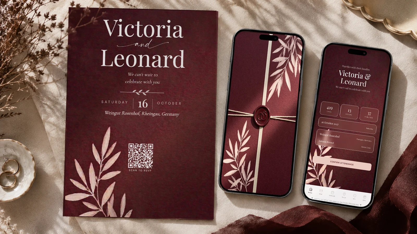
Burgundy pairs best with dusty blush, warm ivory, sage or olive foliage, dusty rose and antique gold. The rule that matters is contrast in lightness: burgundy is a dark, saturated colour, so at least one pale tone has to carry a large share of the palette or the room goes heavy, especially under candlelight. Warm ivory is the safest base and blush is the softener that stops burgundy reading funereal. Green foliage is what keeps it from looking like a corporate colour scheme. Avoid pairing burgundy with black, which collapses into it in photographs, and with bright red, which fights it. A reliable build is burgundy #9E4257 as the lead, wine #7B2B3A for depth, blush #D9A9AE as the softener and foliage green #6E7A5E to keep it alive. The Private Wedding App is 19.99 a month with a 3-day free trial, or 189 once for lifetime access.
Burgundy is the colour couples choose when they want the wedding to feel like an occasion rather than a garden party. It is deep, it is adult, and it holds up indoors in a way that pale palettes do not. It also has one specific trap: burgundy is very close in value to black and to brown, so the colours you put beside it decide whether the room reads rich or reads heavy. Most burgundy weddings that go wrong go wrong by pairing dark with dark. This guide covers the pairings that keep it rich, the exact values, and where each one belongs.
The burgundy palette, with the exact values
Burgundy covers everything from a bright claret to a near-black oxblood. The version that photographs best at a wedding is a true burgundy with a touch of pink in it, which is what keeps it from going brown under warm venue lighting.
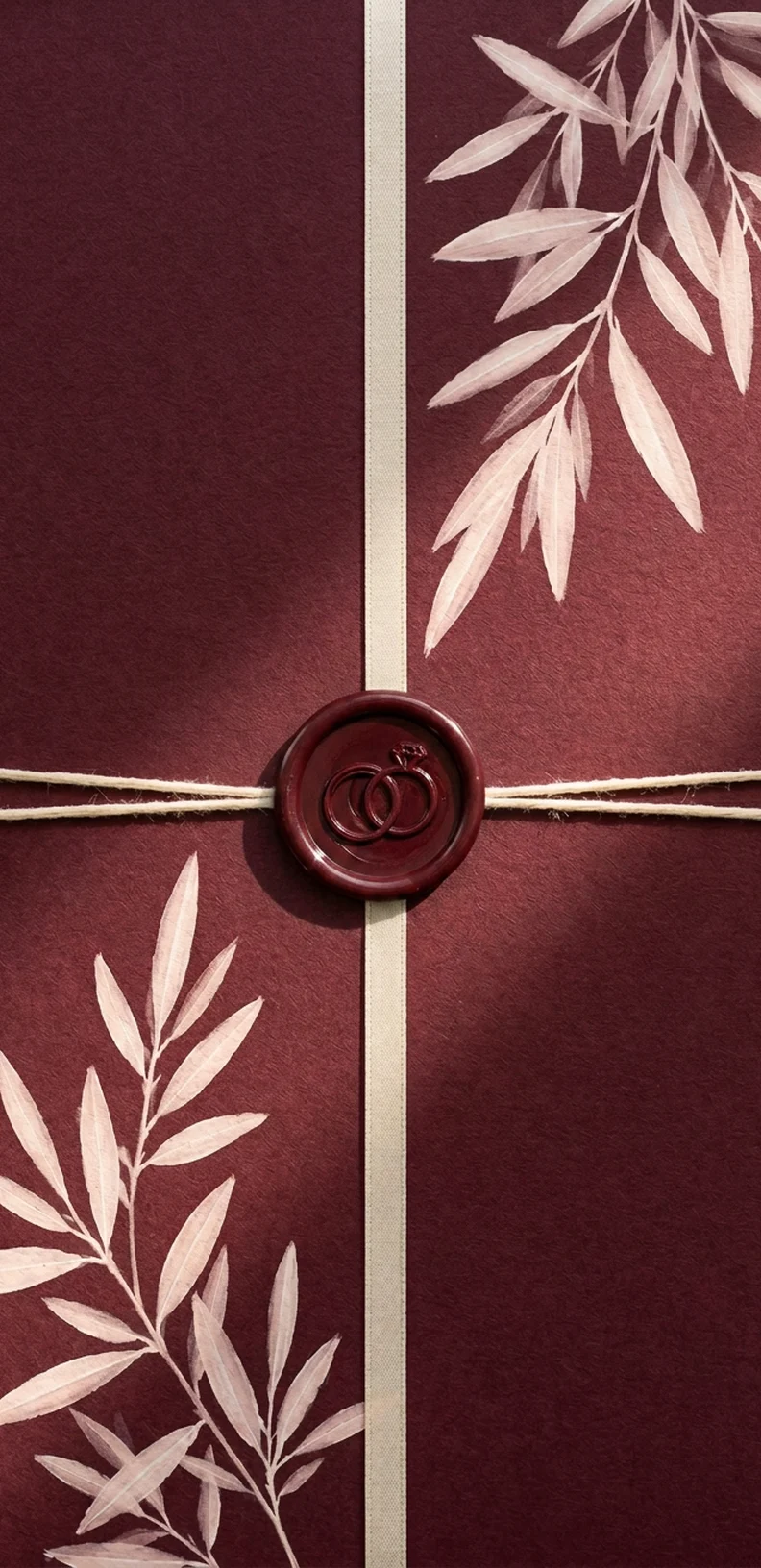
These four values are the ones the burgundy theme uses, sampled from the artwork. Hand them to a florist or a stationer and you will get back what you pictured rather than their idea of burgundy.
Note the proportion. Burgundy is a lead colour, not a base colour. If more than about thirty percent of what a guest sees is burgundy, the room starts to feel like a members' club.
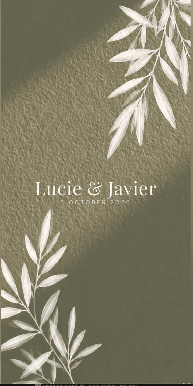
Sampled from the sage botanical invitation - tap any shade to copy its hex code.
The pairings that work
Dusty blush is the one that does the most work. Burgundy on its own is serious, and in a dim room it can tip into sombre. A muted blush, nothing bright or sugary, lifts it immediately and reads as intentional rather than romantic-by-default.
Warm ivory is the base. Not white. Burgundy against a cold optical white is a stark, high-contrast combination that looks severe in photographs. Against a warm ivory it looks like a lit room, which is what you want.
Green foliage is the thing people forget. A burgundy and blush palette with no green in it looks synthetic, like a colour scheme rather than a wedding. Sage or olive in the greenery is what grounds it.
Antique gold, again rather than polished gold. Burgundy and bright yellow gold is a Christmas combination and it is very hard to shake once it is in the room.
Dusty rose extends the palette upward if you need a fifth tone for bridesmaids in different dresses. It sits between burgundy and blush and keeps the group coherent without matching exactly.
What to avoid beside burgundy
Black is the mistake. On a screen, burgundy and black looks sophisticated. In a photograph taken in a dim reception room, the two collapse into a single dark mass and the burgundy stops being a colour at all. If you want darkness, use the wine tone, which keeps its hue.
Bright red fights burgundy rather than supporting it. They are close enough in hue to look like a mismatch rather than a contrast.
Navy is a near miss. It can work in daylight, but under warm evening light both go muddy and the palette loses its structure. If you want a cool second colour, a desaturated blue grey is safer.
And watch the overall darkness. If you list your palette and three of the four are dark, add a pale tone before you book anything.
- Make sure at least one pale tone carries a large share of the palette
- Use warm ivory rather than white
- Replace black with the deeper wine tone
- Put real green in the florals
- Choose antique gold over polished yellow gold
Keeping the palette intact from invitation to table
The invitation sets the expectation. If it goes out in a deep burgundy and the day arrives in a brighter claret, guests notice, even if they could not tell you why.
Decide the four values once and keep them where your florist, stationer and venue can all read them. In the burgundy theme the values above are already applied across the invitation, the RSVP, the schedule, the venue page and the printable QR card.
Guests get one link. Names over the artwork, then the details, then an RSVP that takes about thirty seconds and captures meal choice, allergies and plus-one. Those answers build the guest list, the caterer numbers and the seating chart without you retyping anything.
The same palette prints as a QR card for place settings or to post with a paper invitation, so you are not running a digital system and a paper one in two different shades of red.
Everything you need, in one place
Planning your own wedding without a planner is entirely achievable.
See it for yourself.
Explore the whole platform: cinematic invitation, RSVP with meals and allergies, guest list, seating chart, budget, vendors, checklist, moodboard, photo sharing and the AI planner. No account needed.
Try the full planner →What colour goes best with burgundy for a wedding?
Dusty blush, because burgundy is dark and saturated and blush provides the lightness contrast without the severity of white. Warm ivory as the base, sage or olive in the greenery, and antique gold as the metal complete it.
Does burgundy go with black at a wedding?
It is the most common mistake. Burgundy and black look sophisticated on a screen but collapse into one dark mass in photographs taken in dim reception lighting. Use a deeper wine tone instead, which keeps its hue.
Does burgundy go with navy?
Only in daylight. Under warm evening lighting both colours go muddy and the palette loses its structure. A desaturated blue grey is a safer cool second colour for an evening wedding.
Is burgundy only an autumn wedding colour?
No, but it behaves differently by season. In autumn it pairs with rust and gold, in spring and summer it needs more blush and more green to keep it from feeling heavy against bright daylight.
What metal goes with burgundy?
Antique or champagne gold. Polished yellow gold beside burgundy reads as Christmas and is very hard to undo once it is in the room. Silver works but cools the palette considerably.