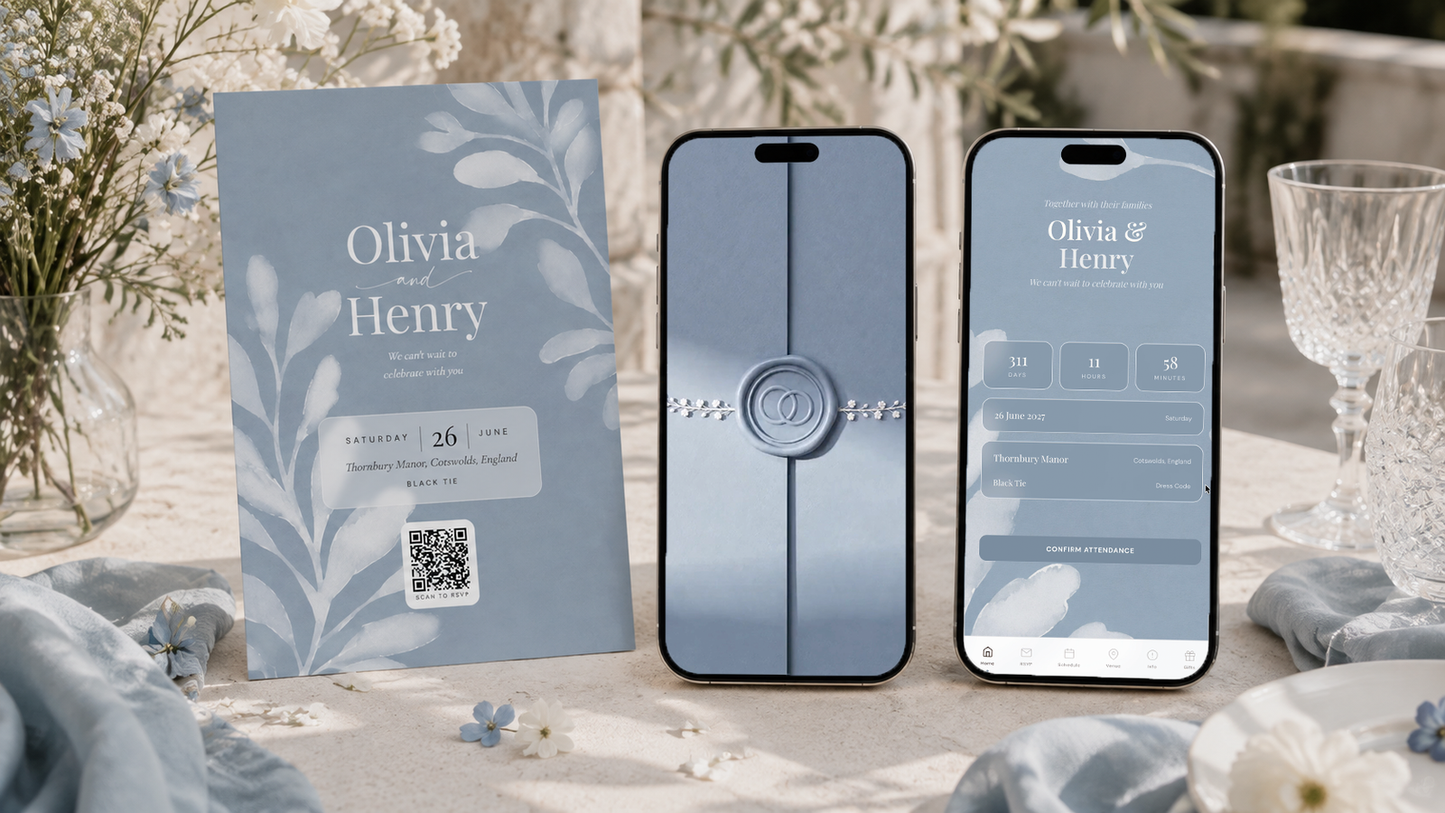
Dusty blue pairs best with warm cream, sage green, dusty blush, soft grey and pewter or brushed silver. Cream rather than white is the base, because dusty blue is already cool and a cold white pushes the whole palette towards grey. Sage is the strongest partner, since both are muted and neither competes, and blush is what stops the result from feeling cold. The thing to watch is contrast: dusty blue, grey and cream are all low saturation, so a palette built only from those reads washed out in photographs. One deeper tone, either a deep slate blue or a real green, has to carry the structure. A reliable build is dusty blue #8FA7BF as the lead, deep blue #5E7A94 for structure, mist #C8D6E2 as the light tone and cream #EFE9DF as the base. The Private Wedding App is 19.99 a month with a 3-day free trial, or 189 once for lifetime access.
Dusty blue is what couples choose when they want blue without the formality of navy. It is a blue with the saturation taken out, which is exactly why it works: a muted colour sits behind the people in a photograph instead of competing with them. It is also one of the few palettes that reads equally well at a spring lunch and an autumn evening. The risk with dusty blue is the opposite of burgundy's. Where burgundy goes heavy, dusty blue goes bland, because every colour in the obvious pairing list is also muted. This guide covers how to keep it soft without letting it disappear.
The dusty blue palette, with the exact values
Dusty blue is a desaturated mid blue with a grey base. The distinction that matters is whether it leans green or leans purple: a green-leaning dusty blue sits beautifully with sage, a purple-leaning one fights it.
These four values are the ones the dusty blue botanical theme uses. They lean very slightly green, which is why sage works so well beside them.
The proportion is the whole game here. Because every tone is muted, you need the deep blue doing real structural work or the palette has no backbone.
Sampled from the sage botanical invitation - tap any shade to copy its hex code.
The pairings that work
Sage green is the strongest partner dusty blue has. Both are muted, both have a grey base, and neither pulls focus. Used together with cream they make a palette that is almost impossible to get wrong, which is why it has become the default for garden and vineyard weddings.
Warm cream over white, for the same reason as every other palette here. Dusty blue is cool. A cold white beside it makes the whole scheme feel like a hospital corridor. Cream warms it.
Dusty blush is the softener and the one that keeps dusty blue from feeling corporate. Blue and grey together can read businesslike, and a small amount of blush removes that entirely.
Pewter or brushed silver rather than gold. This is the one palette on this page where silver genuinely beats gold, because the cool metal belongs with the cool colour. Gold is not wrong, but it makes the palette look warmer and less distinctive.
And one deeper tone, which is the step most people skip. Without the deep slate blue carrying ten to twenty percent, the photographs come back looking faded.
Why dusty blue photographs better than navy
Navy is a stronger colour on paper and a harder colour in a photograph. It is dark enough that in anything less than full daylight it loses its blue entirely and reads as black, which means a navy bridesmaid line indoors frequently comes back looking like a row of dark shapes.
Dusty blue stays blue. Because it is lighter and desaturated, it keeps its hue across a far wider range of lighting, from midday sun to candlelight, and it does not fight skin tones the way a saturated blue can.
That does not make navy wrong. If your wedding is a formal evening event in a well-lit room, navy has an authority that dusty blue does not. But for anything outdoors, anything at golden hour, or anywhere the lighting is out of your control, dusty blue is the safer choice.
The compromise many couples land on is dusty blue for the bridesmaids and the stationery, with navy reserved for the groomsmen, where a dark suit is reading as a dark suit anyway.
- Use cream rather than white on paper and linen
- Include one deeper tone or the palette will photograph faded
- Choose pewter or brushed silver over gold
- Add blush if the scheme starts to feel corporate
- Reserve navy for suiting rather than stationery
Keeping the palette consistent
Muted palettes drift more than saturated ones, because the differences are small enough to miss one at a time and obvious once they are all in a room together. Three slightly different dusty blues look like a mistake.
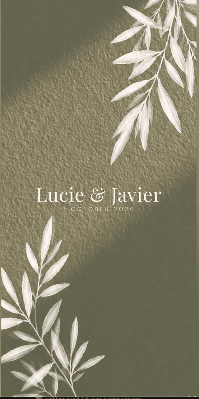
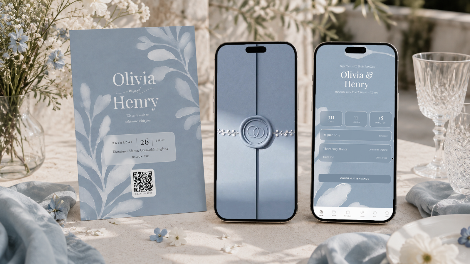
Fix the four values once. In the dusty blue botanical theme they are already applied across the invitation, the RSVP, the schedule, the venue page and the printable QR card, so the guest-facing side is consistent without you policing it.
Guests open one link, see the details, and RSVP in about thirty seconds with meal choice, allergies and plus-one. Those replies build the guest list, the caterer counts and the seating chart on your side.
The same palette prints as a QR card for place settings or to post with a paper invitation.
Everything you need, in one place
Planning your own wedding without a planner is entirely achievable.
See it for yourself.
Explore the whole platform: cinematic invitation, RSVP with meals and allergies, guest list, seating chart, budget, vendors, checklist, moodboard, photo sharing and the AI planner. No account needed.
Try the full planner →What colours go best with dusty blue for a wedding?
Warm cream as the base, sage green as the partner, dusty blush as the softener and a deep slate blue for structure. Pewter or brushed silver is the metal that suits it best.
Is dusty blue better than navy for a wedding?
For anything outdoors or in uncontrolled lighting, yes. Navy loses its blue and reads as black in dim light, while dusty blue keeps its hue from midday sun to candlelight. Navy has more authority at a formal, well-lit evening event.
Does dusty blue go with gold?
It works, but pewter or brushed silver suits it better because the cool metal belongs with the cool colour. Gold warms the palette and makes it less distinctive.
Do dusty blue and sage green go together?
They are one of the strongest pairings available. Both are desaturated with a grey base, so neither competes, and with a warm cream base the combination is very hard to get wrong.
Why does my dusty blue palette look washed out in photos?
Almost always because every tone in it is muted. Dusty blue, grey and cream are all low saturation. Add one deeper tone, either a deep slate blue or a real green, carrying ten to twenty percent of what guests see.