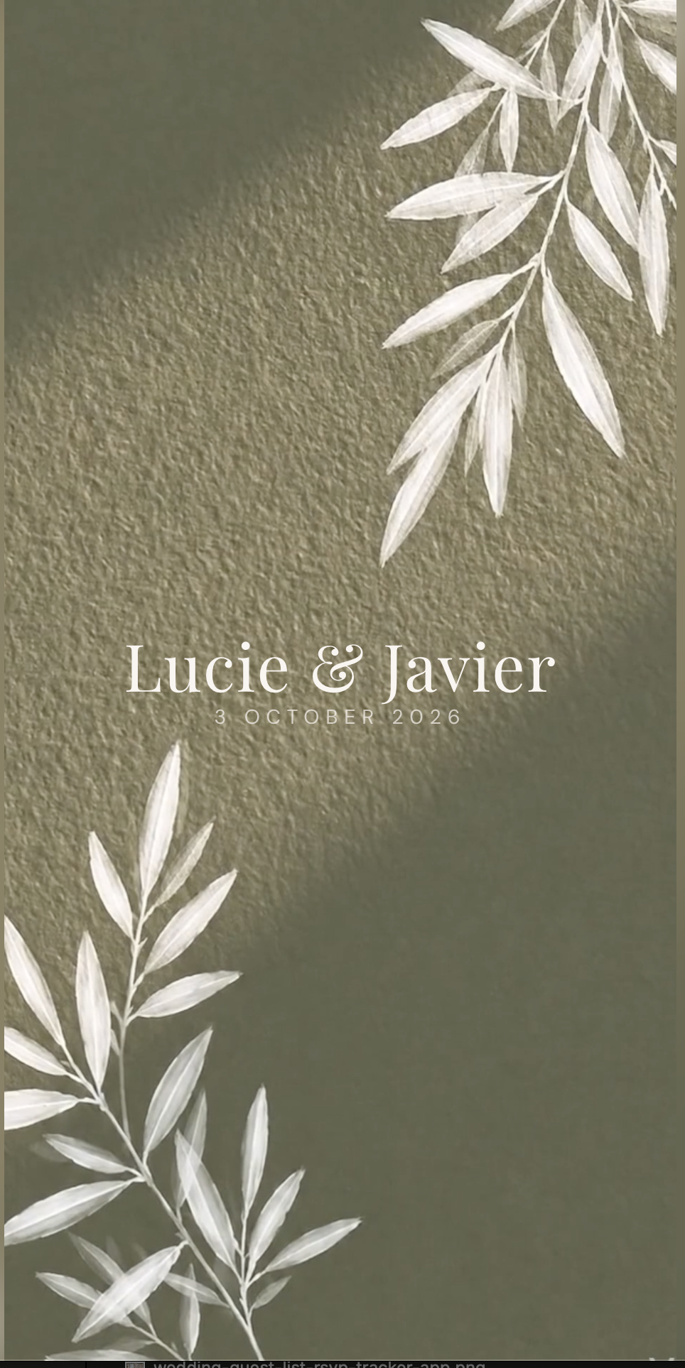
Sage green pairs best with warm ivory, deep olive, terracotta, dusty blush and soft antique gold. Warm ivory rather than bright white is the single most important choice, because sage has a grey undertone and a cold white makes it look drained. Olive gives the palette depth for evening, terracotta adds warmth without competing, and blush keeps it romantic rather than botanical. Avoid pure black, silver and anything neon beside sage: black flattens it in photographs and silver pulls out the grey. A reliable four-colour build is sage #8A9A7B as the lead, olive #5F6F52 for depth, eucalyptus #C9D2BE as the light tone and ivory #EDE7DB as the base. The Private Wedding App is 19.99 a month with a 3-day free trial, or 189 once for lifetime access.
Sage green is the colour couples keep coming back to, and the reason is simple: it is a neutral pretending to be a colour. It sits beside almost anything without fighting it, it reads expensive in daylight, and it does not date the photographs the way a trend colour does. The difficulty is that sage covers a wide range. A grey sage and a yellow sage are not the same colour, and a pairing that sings with one goes muddy with the other. This guide gives you the pairings that hold up, with the exact values, and shows where each one belongs across the invitation, the flowers, the table and the bridesmaids.
The sage palette, with the exact values
Sage is not one colour. The version that works hardest at a wedding is a mid sage with a grey undertone: strong enough to read as green in a photograph, soft enough that a hundred guests in it do not look like a uniform.
These four are the values the sage botanical theme uses, sampled from the artwork rather than picked from a colour wheel. They are given here so you can hand them to a florist, a stationer or a bridesmaid shopping online and get back what you actually pictured.
The ratio matters more than the colours. Roughly sixty percent of your base tone, thirty percent of the lead colour, ten percent of the accent. Four colours used in that proportion will always look more considered than six used equally.
Sampled from the sage botanical invitation - tap any shade to copy its hex code.
The five pairings that work, and why
Warm ivory is the one to get right first. Sage carries a grey undertone, so a bright optical white next to it reads as cold and makes the sage look washed out. An ivory with a yellow base does the opposite: it warms the sage and makes the whole palette look softer and more expensive. This is the single cheapest upgrade available to you, because it costs nothing to specify.
Terracotta is the pairing people underestimate. Sage and terracotta sit opposite each other in temperature, so the contrast is warm against cool rather than light against dark, and that is what stops a green palette from going flat. Used at ten percent, on a ribbon or a menu border, it lifts everything.
Dusty blush keeps sage romantic. On its own sage can read botanical, almost herbal. A muted blush, not a bright pink, pulls it back towards the wedding and photographs beautifully in late afternoon light.
Antique gold rather than bright gold. Sage against a polished yellow gold looks like Christmas. Against a brushed antique or champagne gold it looks like Tuscany. Same metal, completely different result.
Deep olive is your evening colour. Daylight flatters sage, candlelight drains it. Olive in the linens and the foliage holds the palette together once the sun goes down.
What to avoid beside sage
Pure black is the common mistake. It looks sharp on a screen and flattens sage in a photograph, because black absorbs the light that would otherwise bounce back through the green. If you want contrast, use the deep olive instead. It does the same job and keeps the palette alive.
Silver and chrome pull the grey out of sage and make it look cold and slightly institutional. If you need a cool metal, pewter is far more forgiving than polished silver.
Bright white has already been covered but it is worth repeating, because it is almost always the default on anything you order online. Specify ivory, every time.
And resist the sixth colour. Every palette that goes wrong went wrong by addition. Four colours in the right proportion will do more than six fighting each other.
- Specify warm ivory, never bright white, on paper and linen
- Swap black for deep olive wherever you want contrast
- Choose antique or champagne gold over polished yellow gold
- Keep the accent colour under ten percent of what guests see
- Stop at four colours
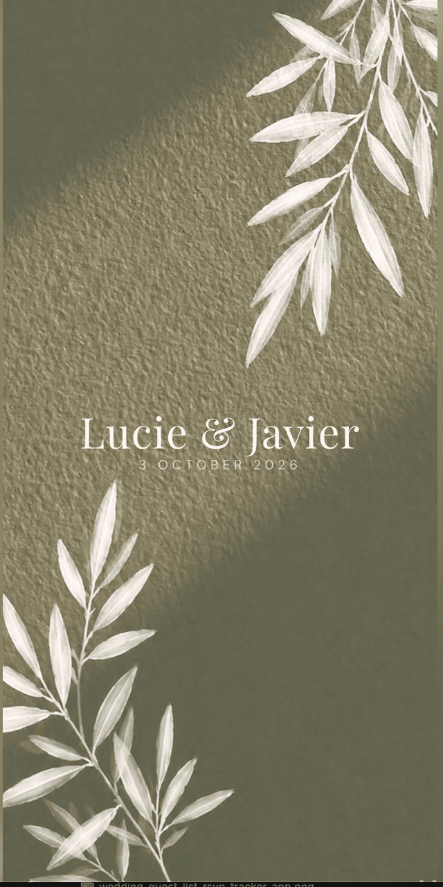
Carrying the palette from the invitation to the table
A palette falls apart in the gap between the invitation and the day. The invitation goes out in sage and ivory, then the save the date is a different green, the website is a template in someone else's colours, and by the time the menus are printed nobody can remember the original.
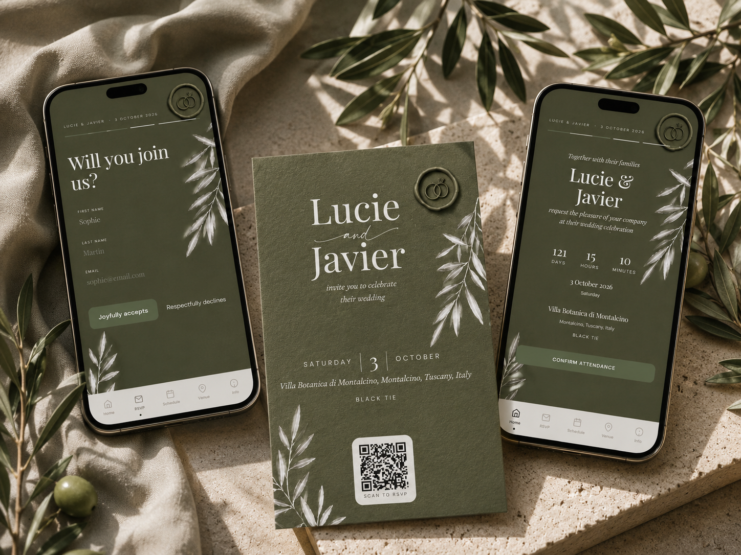
The fix is to decide the four values once and keep them somewhere everyone can read. In the sage botanical theme the palette above is already applied across the invitation, the RSVP, the schedule, the venue page and the printable QR card, so the guest-facing side is consistent without you managing it.
What guests see is one link. It opens with your names over the botanical artwork, then the details, then an RSVP that takes about thirty seconds and collects meal choice, allergies and plus-one. Those replies build the guest list, the caterer numbers and the seating chart behind the scenes.
For the physical side, the same palette prints as a QR card you can put on a place setting or post with a paper invitation, so the people who want something in hand get it without you running two systems.
Everything you need, in one place
Planning your own wedding without a planner is entirely achievable.
See it for yourself.
Explore the whole platform: cinematic invitation, RSVP with meals and allergies, guest list, seating chart, budget, vendors, checklist, moodboard, photo sharing and the AI planner. No account needed.
Try the full planner →What is the best colour to pair with sage green for a wedding?
Warm ivory, because sage has a grey undertone that a bright white drains and a warm ivory lifts. After that, deep olive for depth, terracotta for warmth, dusty blush for romance and antique gold as the metal.
Does sage green go with gold or silver?
Gold, but antique or champagne gold rather than polished yellow gold, which reads festive beside sage. Silver pulls out sage's grey undertone and makes the palette look cold. If you want a cool metal, pewter is more forgiving.
Is sage green still in style for 2027 weddings?
Yes. Sage behaves like a neutral rather than a trend colour, which is why it has held for several seasons where brighter greens have not. It does not date photographs the way a colour of the year does.
What colours should you avoid with sage green?
Pure black, which flattens sage in photographs, polished silver, which emphasises its grey undertone, bright optical white, which drains it, and any neon. Use deep olive instead of black when you want contrast.
How many colours should a wedding palette have?
Four is the practical maximum, used at roughly sixty percent base, thirty percent lead colour and ten percent accent. Palettes almost always go wrong by addition rather than by the wrong choice of colour.